.png)
The Architecture of Contrast: Understanding Color Balance & Personal Harmony
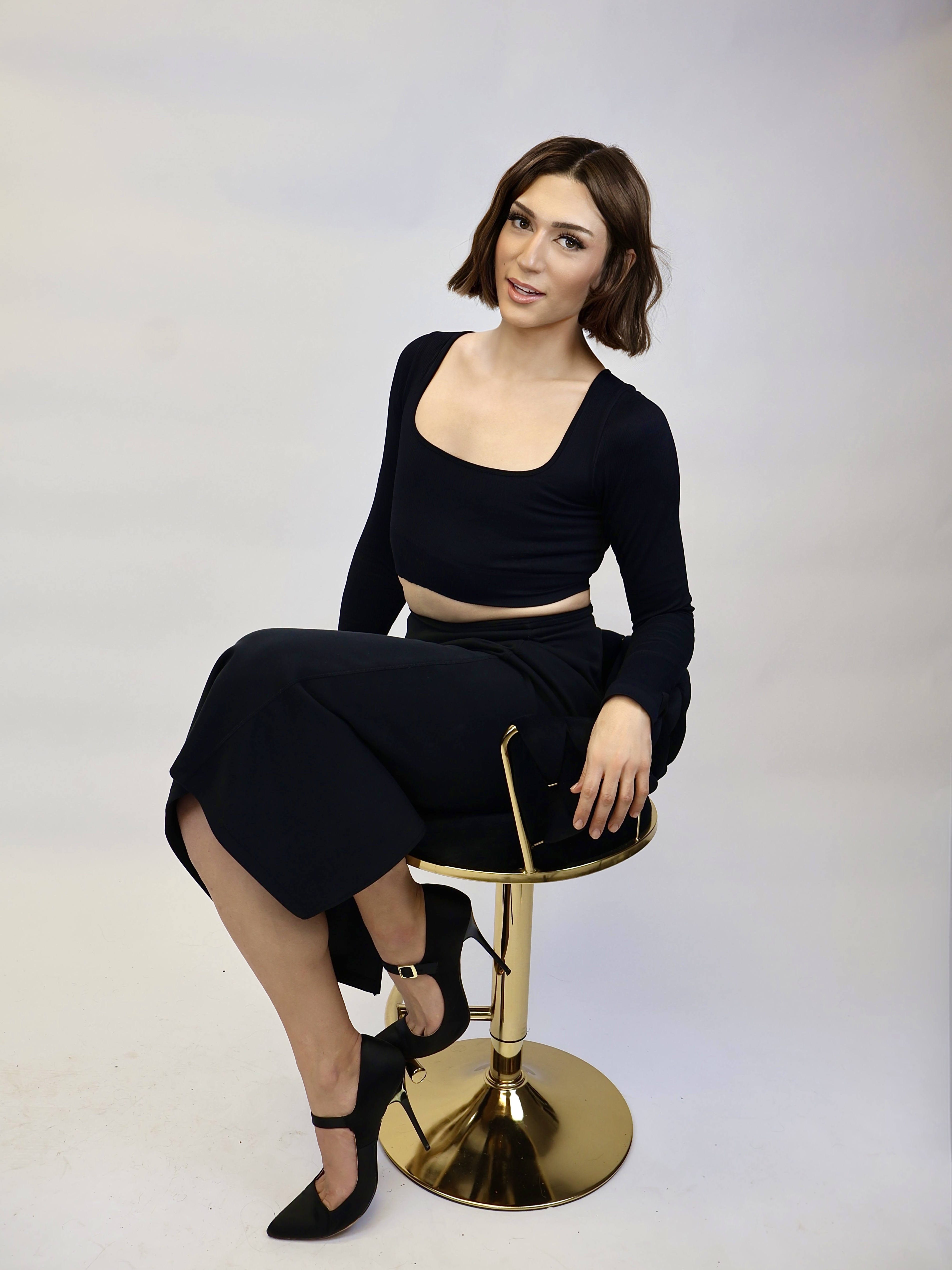
There are those who can wear inky black and optic white effortlessly. And there are those who disappear in it. There are those who glow in softness. And others who require precision and depth to feel complete.
The difference is rarely trend.
It is contrast.
Color harmony is not simply about warm versus cool. It is about balance — the relationship between skin, hair, and eyes. When contrast is aligned, beauty feels effortless. When it is misjudged, even technically flawless work can feel slightly off.
Understanding contrast is one of the most powerful tools a stylist can develop.
What Is Personal Contrast?
Contrast refers to the visual difference between a person’s features.
Specifically:
The depth difference between skin and hair
The clarity or softness of eye color
The overall sharpness or diffusion of facial features
High contrast means strong visual separation. Low contrast means minimal separation.
Neither is superior. But each demands different technical decisions.
High Contrast Clients
High contrast individuals typically have:
Light skin with dark hair
Deep skin with bright whites of the eyes
Very dark brows against lighter skin
Clear, striking eye definition
When these clients go too soft, too warm, or too blended, their presence diminishes.
They benefit from:
Clear tonal separation
Defined depth placement
Precision in color formulation
Stronger lines in haircut or finish
For these clients, muddiness feels like compromise.
Clarity enhances authority.
Low Contrast Clients
Low contrast individuals often have:
Hair and skin within a similar depth range
Soft eye definition
Muted or blended natural coloring
When these clients go too dark or too stark, the result feels harsh.
They benefit from:
Seamless transitions
Soft tonal shifts
Diffused highlights
Blended color placement
For them, softness is not weakness.
It is harmony.
Why Contrast Matters Behind the Chair
When stylists ignore contrast:
Brunettes are lightened beyond harmony
Blondes are softened beyond identity
Extensions overpower facial structure
Trend techniques override personal architecture
When stylists honor contrast:
The client feels “more like themselves”
The result appears elevated without excess
The work looks intentional
Contrast is not restriction.
It is calibration.
Technique Application: Practical Adjustments
For high contrast clients:
Maintain depth near the root
Avoid over-diffusing face framing
Keep brow harmony in mind
Use intentional shadow placement
For low contrast clients:
Blend transitions meticulously
Avoid extreme depth jumps
Choose tonal families that reflect skin softness
Diffuse brightness gradually
The goal is not to follow a seasonal color system rigidly.
The goal is to preserve visual coherence.
Beyond Trend
Trend asks, “What is popular?”
Contrast asks, “What is proportionate?”
When proportion is respected, beauty feels effortless.
When it is ignored, technique feels forced.
The most refined stylists are not trend interpreters.
They are observers of structure.
They understand that every client carries a visual rhythm — and that their role is not to overwrite it, but to amplify it.
Color is not decoration.
It is architecture.
And contrast is the blueprint.


Comments